
SuSu
SuSu is a contemporary dance festival identity celebrating Thailand’s creative culture through expressive movement, bold typography, and dynamic visuals.
Role
Graphic Designer
Timeline
1 weeks
Services
Brand Identity,
Art Direction,
Poster Design
Tools
Figma, Illustrator
SuSu
SuSu is a contemporary dance festival identity celebrating Thailand's creative culture through expressive movement, bold typography, and dynamic visuals.
Role
Graphic Designer
Timeline
1 weeks
Services
Brand Identity,
Art Direction,
Poster Design
Tools
Figma, Illustrator
Bloom Through Chaos
Bloom Through Chaos
Bloom Through Chaos explores the idea that creativity grows through change rather than perfect balance. Inspired by the spontaneous movement of paint splashes and the freedom of contemporary dance, the identity uses bold colors, layered compositions, and expressive forms to celebrate transformation, movement, and the beauty that emerges from chaos.
Bloom Through Chaos explores the idea that creativity grows through change rather than perfect balance. Inspired by the spontaneous movement of paint splashes and the freedom of contemporary dance, the identity uses bold colors, layered compositions, and expressive forms to celebrate transformation, movement, and the beauty that emerges from chaos.
Why SuSu?
Why SuSu?
SuSu comes from the Thai expression used to encourage and motivate others. It reflects the festival's spirit of energy, resilience, and celebration, creating a short, memorable identity that feels authentic, friendly, and universally recognizable.
SuSu comes from the Thai expression used to encourage and motivate others. It reflects the festival’s spirit of energy, resilience, and celebration, creating a short, memorable identity that feels authentic, friendly, and universally recognizable.
Visual Direction
Visual Direction
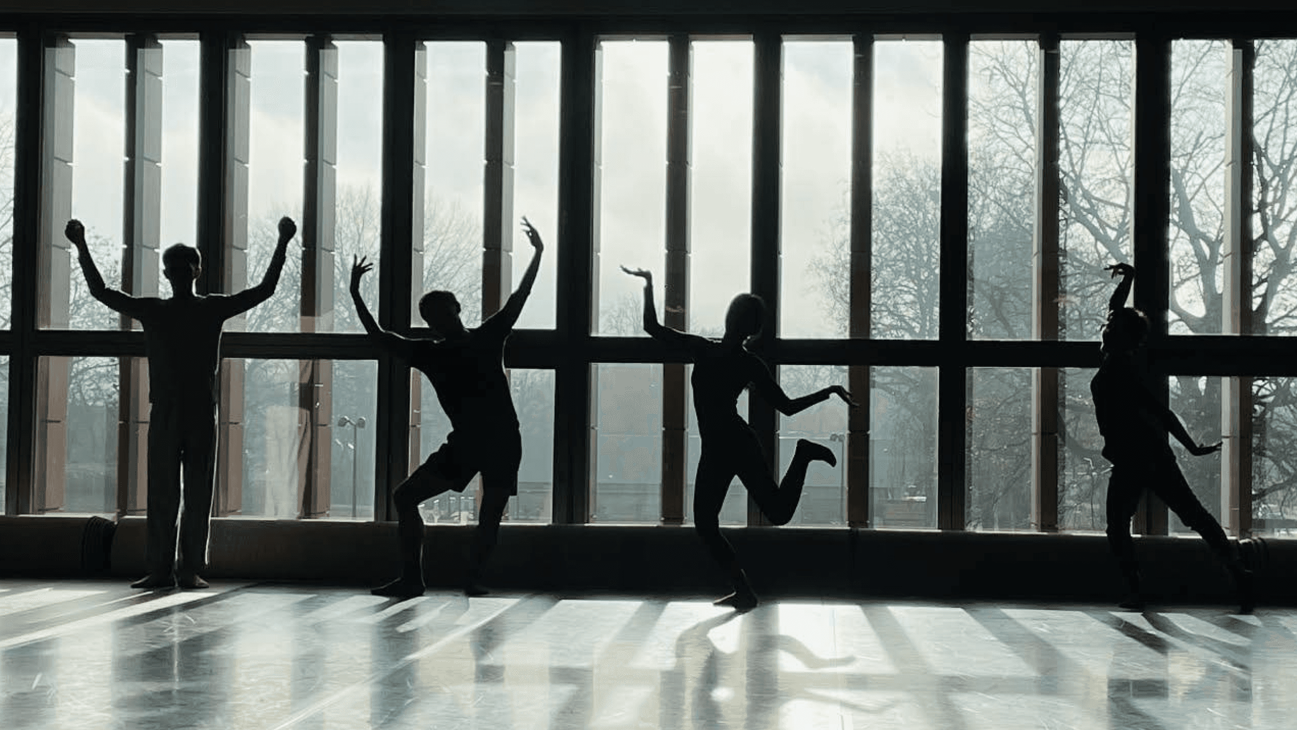
The visual direction combines dance shapes with low-contrast colors to create a unique and artistic look. The subtle colors make the visuals feel softer, but some details may be difficult to see at first.
The visual direction combines dance shapes with low-contrast colors to create a unique and artistic look. The subtle colors make the visuals feel softer, but some details may be difficult to see at first.

Design Concept
Design Concept
The design is inspired by the moment when paint is thrown onto a wall. At first, it looks messy and imperfect, but it gradually forms something beautiful. This idea reflects both the creative process and contemporary dance, where freedom, movement, and experimentation lead to meaningful expression. It became the foundation of the festival's visual identity.
The design is inspired by the moment when paint is thrown onto a wall. At first, it looks messy and imperfect, but it gradually forms something beautiful. This idea reflects both the creative process and contemporary dance, where freedom, movement, and experimentation lead to meaningful expression. It became the foundation of the festival’s visual identity.


20 Design Explorations
20 Design Explorations
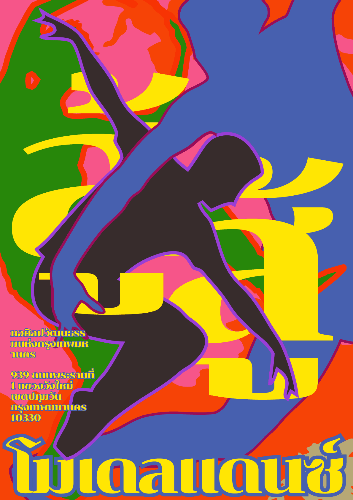
I explored 20 layout and composition variations, experimenting with typography, image placement, color combinations, and visual hierarchy.
I explored 20 layout and composition variations, experimenting with typography, image placement, color combinations, and visual hierarchy.




Final Poster Selection & Refinement
Final Poster Selection & Refinement
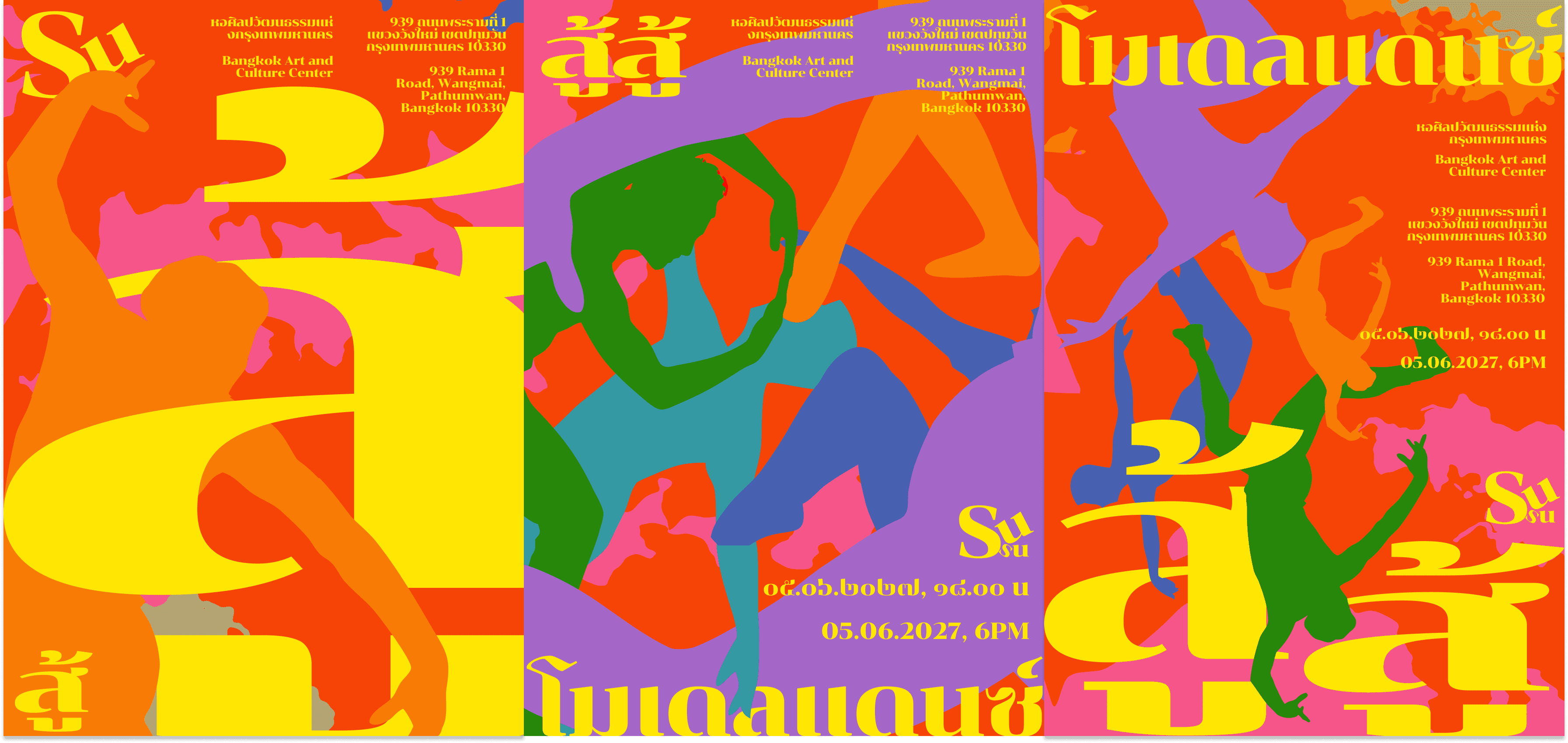
After reviewing 20 poster explorations, I selected the three strongest designs that best captured the festival’s energetic and contemporary identity. I refined the visual system by removing unnecessary strokes from graphic elements, creating a cleaner, more dynamic, and cohesive composition.
After reviewing 20 poster explorations, I selected the three strongest designs that best captured the festival’s energetic and contemporary identity. I refined the visual system by removing unnecessary strokes from graphic elements, creating a cleaner, more dynamic, and cohesive composition.

Key learnings
Key learnings
This project taught me the importance of exploring multiple visual directions, refining ideas through iteration, and creating a flexible identity system that balances expressive movement with clear communication. I learned how typography, composition, and graphic elements can work together to capture the energy and emotion of a dance festival.
This project taught me the importance of exploring multiple visual directions, refining ideas through iteration, and creating a flexible identity system that balances expressive movement with clear communication. I learned how typography, composition, and graphic elements can work together to capture the energy and emotion of a dance festival.