SWEETY HOME
Refreshing a trusted furniture brand with a modern identity and digital-first experience.
Role
Brand Designer
Timeline
3 weeks
Services
Creative Direction, Visual Identity, Brand Strategy, TOV
Tools
Figma

A trusted brand losing relevance
One of Myanmar's leading furniture brands with decades of trust and recognition. Despite its legacy, the brand struggled to connect with a new generation. Its identity felt outdated, its digital presence was limited, and the customer experience relied heavily on physical showrooms.
Low awareness among Gen Z
Limited digital presence
Outdated brand image
Offline-first shopping experience
Finding the opportunity
Competitor analysis revealed a gap in furniture for young urban living, creating an opportunity for Sweety Home to offer modular furniture with a digital-first experience for Gen Z.
Creating a place to call home
Our vision is to become Myanmar's most trusted home living brand, making quality, affordable furniture the first choice for every home. We believe everyone deserves a comfortable space that reflects their lifestyle, regardless of their budget.
Our mission is to help people create a home away from home through thoughtfully designed, affordable furniture. By offering quality products at accessible prices and a seamless shopping experience, we make it easier for people to build spaces where they can live, grow, and feel at home.

Elevated
Everyone deserves a home to be proud of. Young adults and new families can live independently, make thoughtful choices, and build their future while acting responsibly and with care for people, communities, and the planet.

Boundless
Furniture pieces can easily connect and be rearranged in many different ways. The modular system allows customers to mix and redesign their space whenever they want.

Reliable
Since 1995, Sweety Home has grown from a small Mandalay factory to a trusted furniture brand across Myanmar, creating quality pieces that make every home feel personal and welcoming.

Personalized
Homes and pieces of furniture can reflect the personality, taste, and lifestyle of their owners, encouraging self-expression through design, color, and layout choices.
Designed for Real Life
The visual direction highlights bright, natural spaces and authentic everyday moments. Furniture remains the focal point while people naturally interact with it, creating a warm, modern, and relatable lifestyle aesthetic.

BRIGHT & NATURAL

ACTIVE LIVING

PRODUCT FOCUS

FREE STYLE
The colours that define the brand
The colour palette is inspired by Myanmar's cultural heritage, drawing from the warm tones of Bagan and the natural beauty of Inle. It reflects warmth, comfort, and trust while creating a clean, soft, and modern visual identity that feels welcoming across both digital and physical touchpoints.


Bagan
#FAE4D1
Innle
#140C06
Imagination in Every Piece
The Sweety Home logo is built from the letters S and H, shaped using simple geometric forms inspired by modular furniture. Each block represents the flexibility to arrange, combine, and personalize a living space. More than a logo, it reflects the idea that every piece of furniture contributes to a home that grows with its owner—bringing the brand's promise of "Imagination in Every Piece" to life.
S + H +
=
Building through connection
The graphic elements are derived from the geometric forms of the Sweety Home logo and the structure of modular furniture joints. Together, they express connection, flexibility, and creativity, forming a visual system that can be applied consistently across packaging, social media, signage, and brand communications.

Graphic patterns are created using modular rectangle shapes inspired by the brand concept, helping maintain visual consistency and strengthen Sweety Home’s modern identity.

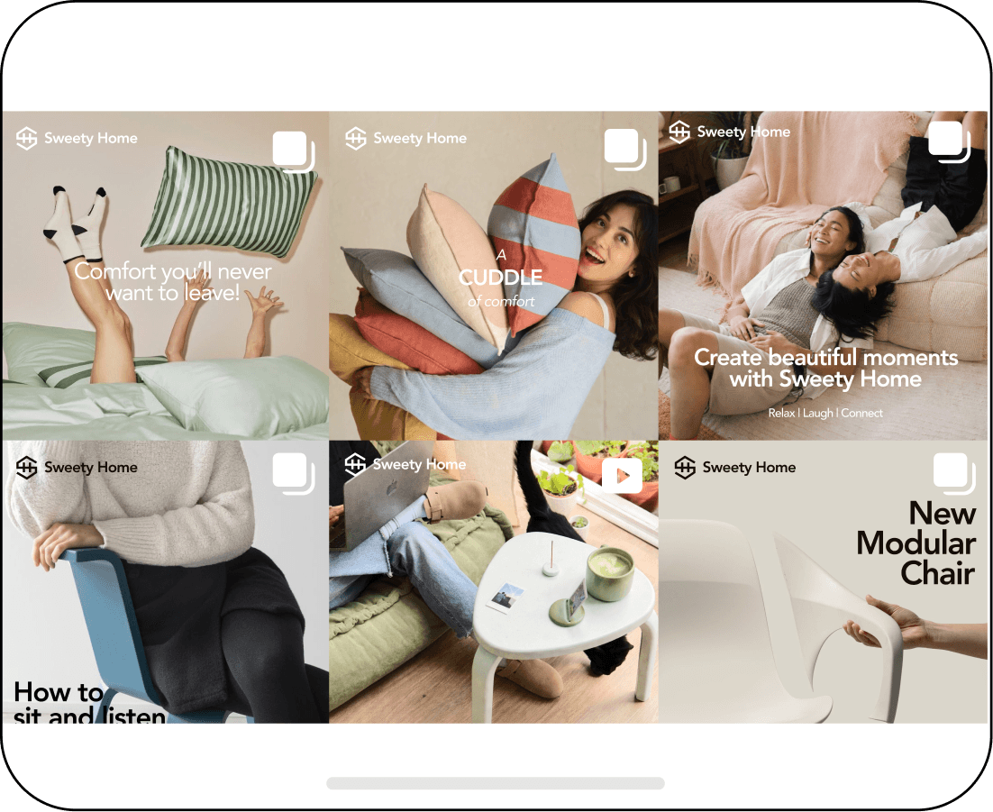
Bringing the brand to life on social media
The graphic patterns create a distinctive visual language across Instagram posts and stories, ensuring every piece of content feels consistent, modern, and instantly recognizable.


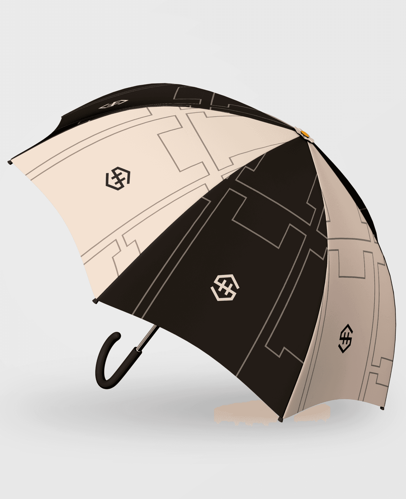
Bringing consistency to every physical touchpoint
The brand extends beyond the logo into every physical touchpoint, creating a consistent and memorable experience. Each interaction reinforces the brand's modern, approachable character while strengthening recognition and trust.


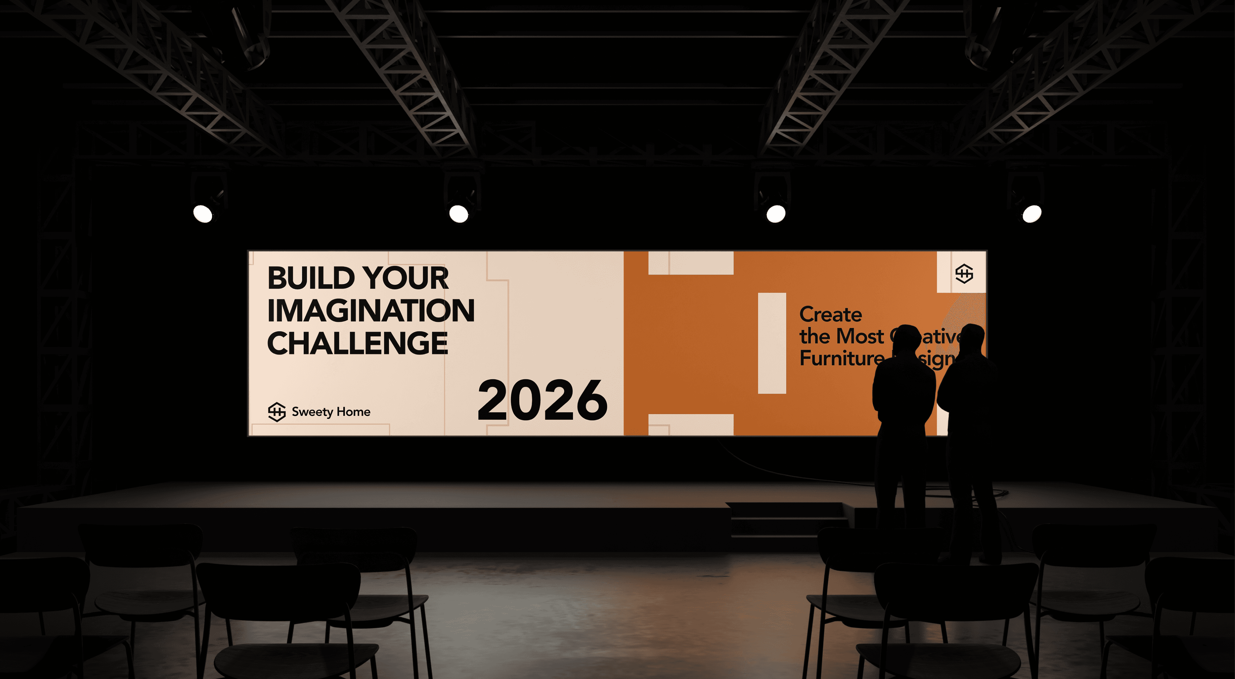
Bringing the Campaign to Life
The campaign identity is applied across pop-up stands, digital display boards, participant T-shirts, signage, and promotional materials, creating a cohesive and memorable brand experience.




Key learnings
I learned that a successful rebrand starts with strategy, not visuals. By balancing heritage with modern expectations, I created a flexible brand system that delivers a consistent experience across digital and physical touchpoints.
z
z
z
SWEETY HOME
Refreshing a trusted furniture brand with a modern identity and digital-first experience.
Role
Brand Designer
Timeline
3 weeks, 2026
Services
Creative Direction, Visual Identity, Brand Strategy, TOV
Tools
Figma
A trusted brand losing relevance
One of Myanmar's leading furniture brands with decades of trust and recognition. Despite its legacy, the brand struggled to connect with a new generation. Its identity felt outdated, its digital presence was limited, and the customer experience relied heavily on physical showrooms.
Low awareness among Gen Z
Limited digital presence
Outdated brand image
Offline-first shopping experience
Finding the opportunity
Competitor analysis revealed a gap in furniture for young urban living, creating an opportunity for Sweety Home to offer modular furniture with a digital-first experience for Gen Z.
Creating a place to call home
Our vision is to become Myanmar's most trusted home living brand, making quality, affordable furniture the first choice for every home. We believe everyone deserves a comfortable space that reflects their lifestyle, regardless of their budget.
Our mission is to help people create a home away from home through thoughtfully designed, affordable furniture. By offering quality products at accessible prices and a seamless shopping experience, we make it easier for people to build spaces where they can live, grow, and feel at home.
Elevated
Everyone deserves a home to be proud of. Young adults and new families can live independently, make thoughtful choices, and build their future while acting responsibly and with care for people, communities, and the planet.
Boundless
Furniture pieces can easily connect and be rearranged in many different ways. The modular system allows customers to mix and redesign their space whenever they want.
Reliable
Since 1995, Sweety Home has grown from a small Mandalay factory to a trusted furniture brand across Myanmar, creating quality pieces that make every home feel personal and welcoming.
Personalized
Homes and pieces of furniture can reflect the personality, taste, and lifestyle of their owners, encouraging self-expression through design, color, and layout choices.
Designed for Real Life
The visual direction highlights bright, natural spaces and authentic everyday moments. Furniture remains the focal point while people naturally interact with it, creating a warm, modern, and relatable lifestyle aesthetic.
BRIGHT & NATURAL
ACTIVE LIVING
PRODUCT FOCUS
FREE STYLE
The colours that define the brand
The colour palette is inspired by Myanmar's cultural heritage, drawing from the warm tones of Bagan and the natural beauty of Inle. It reflects warmth, comfort, and trust while creating a clean, soft, and modern visual identity that feels welcoming across both digital and physical touchpoints.
Bagan
#FAE4D1
Innle
#140C06
Imagination in Every Piece
The Sweety Home logo is built from the letters S and H, shaped using simple geometric forms inspired by modular furniture. Each block represents the flexibility to arrange, combine, and personalize a living space. More than a logo, it reflects the idea that every piece of furniture contributes to a home that grows with its owner—bringing the brand's promise of "Imagination in Every Piece" to life.
S + H +
=
Building through connection
The graphic elements are derived from the geometric forms of the Sweety Home logo and the structure of modular furniture joints. Together, they express connection, flexibility, and creativity, forming a visual system that can be applied consistently across packaging, social media, signage, and brand communications.
Graphic patterns are created using modular rectangle shapes inspired by the brand concept, helping maintain visual consistency and strengthen Sweety Home’s modern identity.
Bringing the brand to life on social media
The graphic patterns create a distinctive visual language across Instagram posts and stories, ensuring every piece of content feels consistent, modern, and instantly recognizable.
Bringing consistency to every physical touchpoint
The brand extends beyond the logo into every physical touchpoint, creating a consistent and memorable experience. Each interaction reinforces the brand's modern, approachable character while strengthening recognition and trust.
Bringing the Campaign to Life
The campaign identity is applied across pop-up stands, digital display boards, participant T-shirts, signage, and promotional materials, creating a cohesive and memorable brand experience.
Key learnings
I learned that a successful rebrand starts with strategy, not visuals. By balancing heritage with modern expectations, I created a flexible brand system that delivers a consistent experience across digital and physical touchpoints.